Hi Friends!
In the spirit of fun summer content and so many of the design community having just returned from Neocon, this month I'm sharing five of my favorite design trends. Okay, these aren't really trends but they're approaches that I loved as a commercial interior designer and they still apply in my role as Creative Director at FMW|FabLab.
1) Streamlined, modern lines
I gravitate towards straight lines and more minimal objects and spaces. I’ve always been averse to visual clutter. But I also think minimalism in fabrication doesn't get the craftsmanship recognition it deserves. There is nothing that showcases an artisan’s skill more than simplicity. You can hide a lot on a piece that has lots of ornament. It’s the reason why trim molding came to be in the first place. But when there’s no where to hide a rough cut or a slightly crooked line, it takes a true artist with skill, patience and instinct to execute.
2) Multiple material compositions
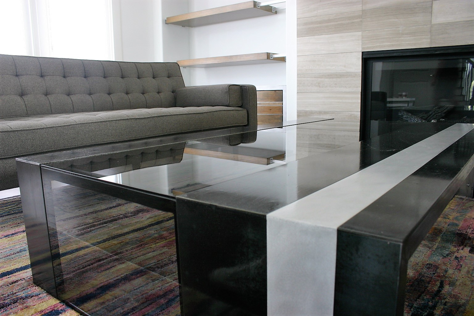
I love a piece or room that mixes wood, metal, glass, stone, fabric, etc. I especially love if all of those things are the same color and it’s the different textures of each that are the showstopper. One of my favorite FMW-created tables is a combination of carbon steel, aluminum and smoked glass (pictured above). It is streamlined, modern, minimal and multi-material. Be still my heart!
3) Black and white
If there is a piece that integrates both points above AND it’s either black or white, I may need CPR. It’s my own design dream! Every room needs something black in it and white has been my favorite color since elementary school. When I first met Mr.FabLab and we were disectingg my preference for white (which apparently is an unusual favorite color), here is what I said:
“I love white because it's a clean slate....fresh, pure, doesn't distract from form and design and architecture...it forces something to be great in what it is and not hide behind a fancy color. It's what angels are clothed in. In the light spectrum it's the combination of all colors that produce white light .....I could probably give you 10 more reasons, but the fact is, I just like it. I think it's the color world's version of perfection.” I think that about covers it!
4) Something completely out of left field
(like a neon accent in a traditional space or a vintage piece in a modern space)
This probably sounds like it flies in the face of the points above. But as much as I love pure, clean and modern, I also love a space that feels “collected over time”, not just curated. I tell my clients that we’re going for “Interior Design magazine”, not “Pottery Barn catalog”. There’s soul in the former. I want evidence of life and sometimes life includes inheriting a beloved grandmother’s rocking chair. Putting that vintage rocking chair in a modern space makes it absolutely regal. The same goes for a neon orange accent in an otherwise traditional space. It lets people know that the person or company this space represents is complex and multi-faceted.
5) The bigger, the better
This primarily applies to furniture and artwork. I do not subscribe to small spaces needing small furniture and art. I always recommend going for as big as physically possible while still allowing for proper circulation space. This rule has never steered me wrong.
Send me some of your favorites or tell me if you don't share mine!
With love,
Mrs. FabLab
P.S. I can't believe it's time again but registration is open for the IIDA NCIDQ exam preparation class. It's my third semester as a class facilitator! Each session is 10 weeks long. If you or someone you know is taking the exam, class starts July 14. Register HERE.